


")
Stepping Out
(Craig H Collins)
Hello again, art lovers. Before we begin, I’d like to share a recent work of mine (at right). Please click the image to see a larger version. You can let me know what you think of it later.

“Angel of Nativity”
(Julia Margaret Cameron)
The Guardian’s Michael Prodger observes: “What some pioneering photographers recognised straight away was that photographs, like paintings, are artificially constructed portrayals: they too had to be carefully composed, lit and produced.” In spite of this, it is hard for modern viewers to discard the notion that photography — unlike other art forms — is supposed to portray something real. Most of us have been trained to think of photographs as documents, time-stamped slices of life, rather than artistic compositions.
The vast majority of photos ordinary people take — think of those trillions of selfies and shots of couples kissing in front of the Eiffel Tower — are indeed documentary in nature. But must they all be? While your creative heart may say no, your interpreting brain wants to see facts, and it isn’t happy when it doesn’t get them. We like our art to say ART on the label, so we can view it with the “proper” frame of mind. That’s why most works of art are either framed, or placed on a pedestal, or performed on a stage. When we experience art in context, we can better calibrate our reactions, thanks to conventions we have evolved to help us distinguish artistic expression from ordinary reality.

Not the National Geographic Photo of the Year
Photographic art blurs this line, and that creates problems. The more crafted a photo looks, the more trouble we have accepting the legitimacy of an image. Consider the image at right: a shark is leaping out of the water to attack a soldier during a helicopter rescue. In the early 2000s, this image was probably emailed a million times — the text claimed it was the “National Geographic Photo of the Year.” It wasn’t, of course.
It was not only not the National Geographic Photo of the Year, it was not even a photo, strictly speaking. It was a mashup of two shots, one of an Air Force training session, the other of a breaching shark by South African photographer Charles Maxwell.
This would be just another tired example of a photoshop hoax were it not for the following tidbit that Mr. Maxwell later revealed to National Geographic:
Maxwell said that he “cheated a bit” to get the [shark] photo. Though he has seen as many as ten breaches in a single morning, it is difficult to predict where a shark will be seen. So he towed a seal decoy made of carpet behind his boat, in order to attract a breaching shark.
Now, who is fooling whom? Mr. Maxwell didn’t “just happen to be there” at that dramatic moment. He fooled the shark, to get it to leap where he would be in position to capture it. Did he say this at the time his shark photo was published? Or did he fool us too?

Whoopi Goldberg
(Annie Leibovitz)
Please do not misconstrue. Mr. Maxwell is no more a fraud than Annie Liebovitz, who is famous for shooting the famous. No, Ms. Liebovitz did not just happen to walk into Whoopi Goldberg’s bathroom as she was taking a milk bath. Yes, the scene was staged, then photographed, and then one of the shots (of who knows how many) was selected as “best” and that is the one that is now famous. But the shot was hardly as spontaneous as it looks.
Unlike the shark photo, it is obvious that the Whoopi photo was crafted. We see right away that it is an artistic/editorial statement, not a document.
When you see a documentary photo, how real do you expect it to be? To help answer this, consider how you would react to the shark image if you were presented with these stories about how it was made:
| “I was on a cruise ship taking photos of the shoreline, when this shark leaped out the water right in front of my camera! It was amazing! How lucky is that!” | 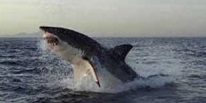 |
| “I saw a shark breach many years ago and wanted to get a photo of one ever since. So I hired a boat and cruised around for hours, until one finally cooperated and leaped in front of me.” | |
| “I have seen many shark breaches and I wanted to get a great photo of one without waiting forever out there. So I hired a boat to drag a seal-shaped lure around and soon a shark breached nearby and I was able to capture it.” | |
| “I had a pretty good shot of a shark breach, but my photo didn’t have the drama I remembered. So, to amp up the action, I added some water splashes around its mouth and body in photoshop.” | |
| “I once saw a shark breach but was too late to grab a shot of it. So I took another shark photo of mine and pasted it on an ocean background in photoshop, and then I added some splashes. This is pretty much how I remember it. It was amazing.” | |
| “I never saw a shark leap out of the water, but I wanted a cool picture for my room that would freak out my buds, so I found a shark photo on the internet and pasted it on an ocean background in photoshop and made a poster. Awesome, man!” | |
After reading these “behind-the-scenes” stories, at what point did you decide that the shark image was no longer very interesting? The sense that an image is contrived makes it lose that “special moment” quality we value. The greater the level of contrivance, the less likely we are to embrace the effort, at least for documentary images. The backstory matters, and it has to reinforce what we see.
• • • • •
Before I leave the topic of reality in documentary photos, I’d like to share three more shots, all of which were taken by photographer Dorthea Lange at a camp for agricultural workers in 1936 (click to enlarge):

Migrant Family
(Dorthea Lange)

Migrant Mother and Child
(Dorthea Lange)

Migrant Mother
(Dorthea Lange)
There is no official record of the order in which these shots of Florence Owens Thompson and her children were taken, but Ms. Lange’s comments suggest the sequence shown here. The third image is the Migrant Mother photo that became the iconic portrayal of the harsh conditions and despair of the Great Depression.
Comparing the photos, one cannot help but see stark differences in composition and feel. In the third image, were the children instructed by the photographer to crowd into the frame and look away? (They did not seem so shy in the first image, and they were nowhere to be seen in the second.) Does it matter what really transpired here, or do editorial goals trump reality?
According to the Library of Congress website, Ms. Thompson “came to regret that Lange ever made the photographs, which she felt permanently colored her with a Grapes of Wrath stereotype. Contrary to the despairing immobility the famous image seems to embody, Thompson was an active participant in farm labor struggles in the 1930s, occasionally serving as an organizer.”
The lesson is, even in documentary photography, the backstory is not always what it seems to be. A talented photographer knows how to “configure” a scene to tell a more compelling backstory, as I believe was done here. In my view, the backstory of Whoopi is more transparent than that of Migrant Mother.*
Curiously, fine art photography is not free of such concerns. You might think that, since it says ART on the label, the only thing that should matter is how it looks on your wall, yes? That’s what I once thought.
• • • • •
As you know, I am also a photographer. I don’t do portraits and rarely shoot landscapes. Mostly I like to find designs in everyday things and create compositions of lines and shapes that play together in the frame (I call them maps). The past few years, I have been trying (with uneven success) to go beyond interesting graphics and somehow instill my “fine art” images with more emotional pull.
")
Yellow Leaf in Pool
(Craig H Collins)
Here is one example (click to enlarge). I took this during a group photo shoot in Asheville in late summer. The theme of the shoot was “Yellow.” I found this leaf outside a downtown restaurant and dropped it into a small water feature nearby. It floated down the channel for several feet and then fell into a little pool, attracting a raft of bubbles.
I rotated the leaf to draw attention to its heart shape and then shot the photo looking straight down the cascade of water.
The photo received a number of positive comments from my fellow shooters, more than any other image from the event, for whatever that’s worth. But I did not post my “production notes” along with the image. Was that necesssary? Did the others assume (and did you) that I came upon this scene by chance?

Beaver Lake, Asheville
(Craig H Collins)
Now, consider this image (click to enlarge), one of the rare landscapes that I printed and sold. The scene is Beaver Lake in Asheville in the springtime. You will notice two sailboats on the lake. Yes, those boats did sail on Beaver Lake. No, there were no sailboats in that spot, on that day.
Moreover, these boats had no crews. They were remote-controlled models, maybe twenty inches tall, operated by members of a local hobby club.
The implied backstory, that a few sailors were enjoying the mountain scenery from their vantage point on the lake that spring day, was a photoshop fabrication. I thought the boats added a graceful, human presence to the scene while providing a minor focal point in the otherwise empty lake. I did consider that those familiar with the lake might reject this premise, while other viewers might find it appealing.
Ironically, the two prints I sold were to a woman who raised her children near Beaver Lake. She wanted to give them to her children as gifts.
Many questions arise. Is a landscape photo a document or is it art? Should I include some kind of disclosure statement with the image to explain the sailboats? If I were to do that, would it not “poison the well?” What about people who never visited Beaver Lake but would simply like a nice landscape to hang on their wall?
Was it wrong to have added the sailboats? Should I have never printed this image if it could not stand on its own? Why would no one question the existence (or reality) of the boats if this had been a painting? In the end, what limits apply — and what freedoms are granted — to the photographic artist?
• • • • •
This brings us back to the image I posted at the top of the page. It started as another one of those “lines, curves and shadows” photos that geometry-lovers go for. But there wasn’t enough there for me. Frankly, I thought it was boring. So I got an old boot from our garage, took a number of photos of it, and pasted the “best one” onto the steps.
")
Before
After
Even if you don’t particularly care for the image, you must admit that the boot invites you to think about the backstory. Once you notice the boot, you can hardly stop your mind from asking, what happened here? It may not add up to anything coherent, but it has more pull than the graphics alone.
This, however, comes at a cost. My photoshop work violates the convention of helping the viewer distinguish artistic expression from ordinary reality. The boot transforms a straightforward geometric study into a enigmatic, possibly-documentary image. The viewer does not know — and is not told — whether this is reality, fiction or “based on a true story.” Once again, the Whoopi photo, though contrived, is more transparent in its production than this image.
Let’s take this a step further (pun noted). If I were Annie Liebovitz, I would have had my assistant bring a boot to the scene, maybe even a boxful of them, and ask her to place a boot on one of the steps, or what-the-hell just throw the whole box down the stairway and let them land as they may. Then I would take the photo. Would this production be more “legitimate” in the eyes of the viewer than using photoshop? If so, why? Is it because “something happened” in the former case and “nothing really happened” in the latter?
• • • • •
")
Tears
(Man Ray)
Man Ray is considered to be avant-garde. Yet his photographs are conventional, in the sense that it is easy for viewers to distinguish embellishment vs. reality.
Jon Stewart of the Daily Show has been called a prophet. Yet his humor is also conventional in the sense that it is easy for viewers for distinguish his satire and absurd premises from reality.
Then there is (or was) Andy Kaufman, who wrote the book on blurring lines.
 Photography needs an Andy Kaufman, someone whose work lays to rest, once and for all, the notion that photos must either depict reality or abstraction and nothing in between. We need this kind of breakthrough so that viewers will be able to see a boot on the stairstep as an artistic flourish rather than a deception and boats on the lake as brushstrokes instead of bogus.
I’m optimistic that one day we will see an Andy Kaufman of photography, a master of the blurred line, who will make creative photographs no more threatening to our sense of time and reality than the paintings of Picasso, Duchamp and Dali.
Until then, photographers shoot and adjust and edit, and some of us express our doubts whether what we do is art or artifice, real or tangled, craft or craftiness, treasure or trash.
____________________

Love this piece, Craig! You’ve managed to expertly articulate in one place the various arguments surrounding photographic art that I’ve heard over my entire lifetime.
Art has long been a means of the artist’s propaganda, so why should photography be any different? Blurring the lines to create an image that is not only visually powerful, but conveys a meaningful message, is inherent to all the arts.
The only difference is that today many lay people are still ignorant of photography’s stunning role in the arts, and are stuck in the belief that whatever photographic image they see should depict reality. (Which is fine for journalistic photography.) Yet faced with a recording of “reality music”, ie. bird song, wind blowing, fire crackling, etc, they would be profoundly bored.
Love the photos you used for examples….especially ‘Stepping Out’ and Andy with a Pearl Earring. (Guessing that’s Andy?) Laughed aloud at that one.
Maybe you’ll prove to be the ‘Andy Kaufman’ of photography…the ‘Craig Collins’ of photography, if you will. 🙂 Wouldn’t surprise me in the least.
The image “Stepping Out” and your explanation of its creation leave me in a quandary. I have, for many years worked in the b&w found object genre. On a number of occasions I have moved or removed an object in order to improve the composition of the image. I always feel slightly guilty when doing so.
I have also done commercial studio photography, in which everything is carefully placed, and nothing is “real”. I never felt guilt about this, assuming that every knew that it was artifice.
So your image, which from all appearances seems to be in the first category, actually is a hybrid of the two.
The result is that I appreciated your photo until I read your explanation; now I’m less interested in it. I’m not criticizing your photo or your methods. I do thank you for giving me the opportunity to consider the spectrum of photographic veracity.